eCommerce UI Design
A small project experimenting with colour and iconography to create an eCommerce stores user interface.
The Goal
The goal was to create a series of art boards depicting a fictional e-commerce application from the product view down to the shopping tools, such as search and the shopping basket itself.
Art Direction
This store would be selling high end products from well established brands so the design would need to be able to take a back seat, allowing the quality of the products on display to take centre stage.
I chose to use a simple colour palette of deep blues, golds, greys, and white to create the branding. Using a solid white background as the main area for displaying the products.
Fonts
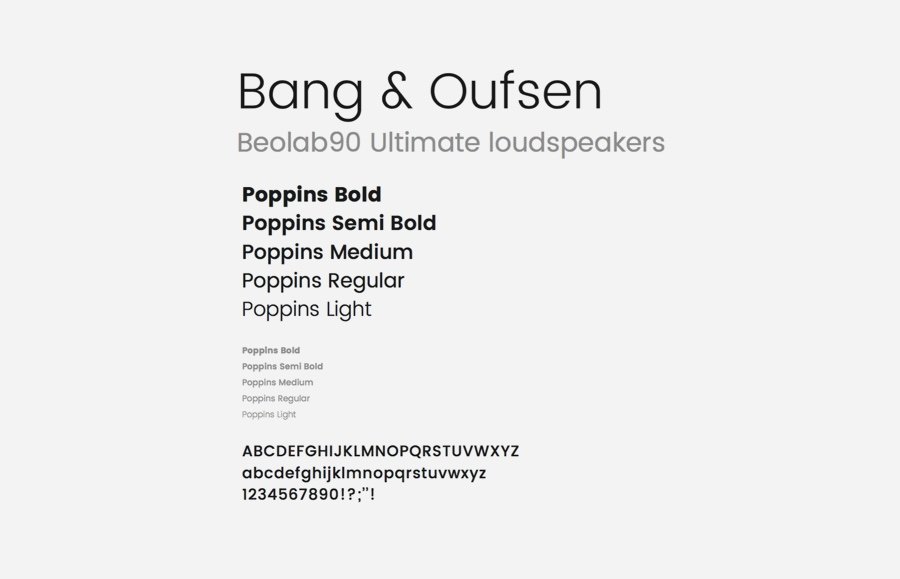
The font family I chose to use is Poppins, a Google font that I felt
had a decent balance between being clean and modern without being too clinical.
A mixture of font weights and sizes were used to give the content a sense of hierarchy. I did explore other more established options for fonts but felt it would be good to create a design using something new.
Iconography
A simple icon set designed specifically for this project. The challenge was to try and learn and further develop my skill set while creating a functional set of icons to use in the design.
I created this icon set to work alongside the Poppins font family which is used for all of the primary headings. The icons are curved and softer than I originally planned, but the curved edges were more challenging for me to work on and therefore a bit more fun to create and learn from.
Created on a 200px square grid to try and keep the icons a consistent size while giving me enough pixels to create a smooth series of curves in each design.


