Flight App UI Design
A Concept design for the UX/UI for a mobile flight bookings system. Giving me the opportunity to prototype and animate the micro interactions.
The Foundations
I used this personal project as an opportunity to focus on creating a series of designs, icons and prototype animations from the ground up.
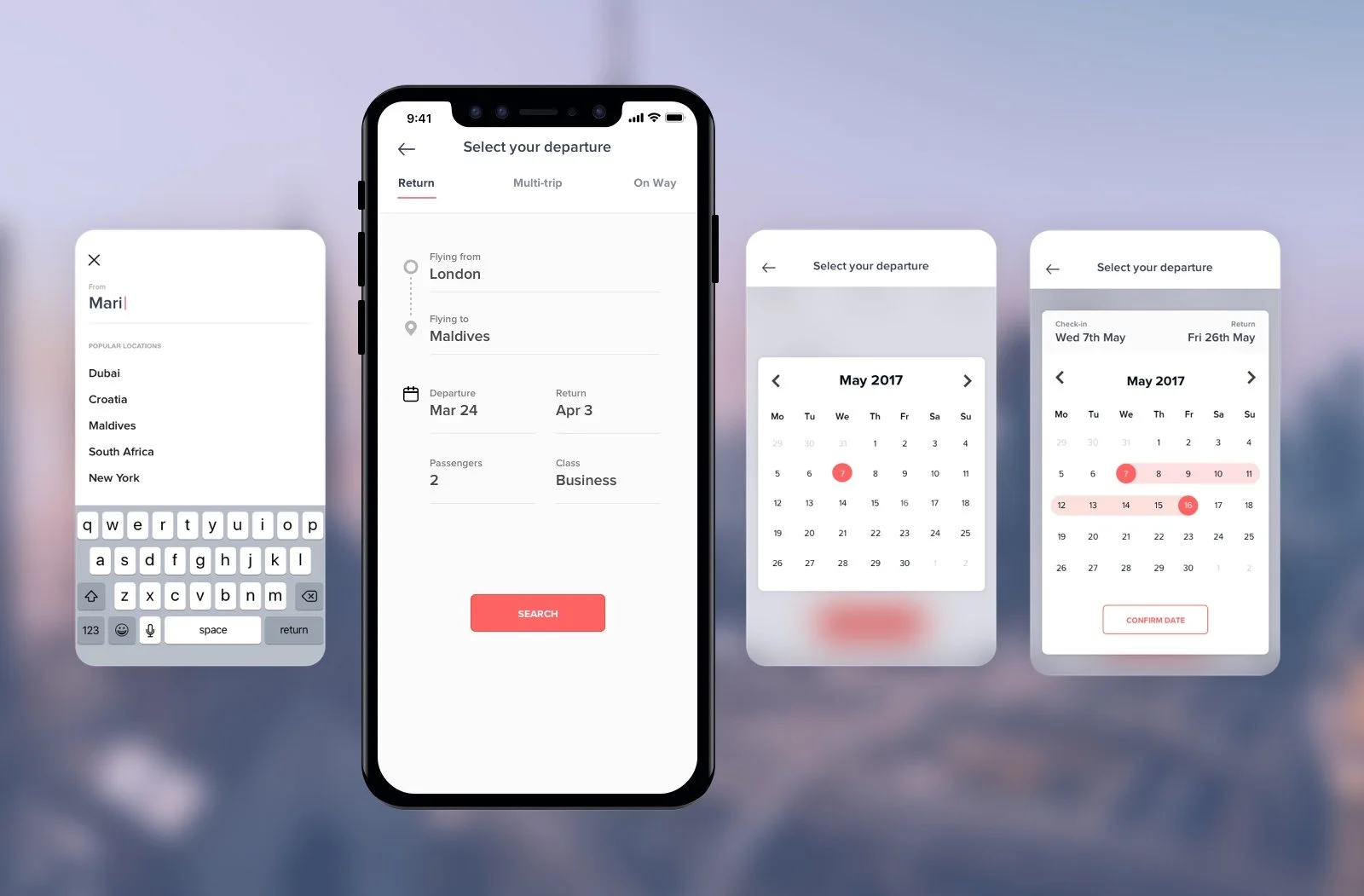
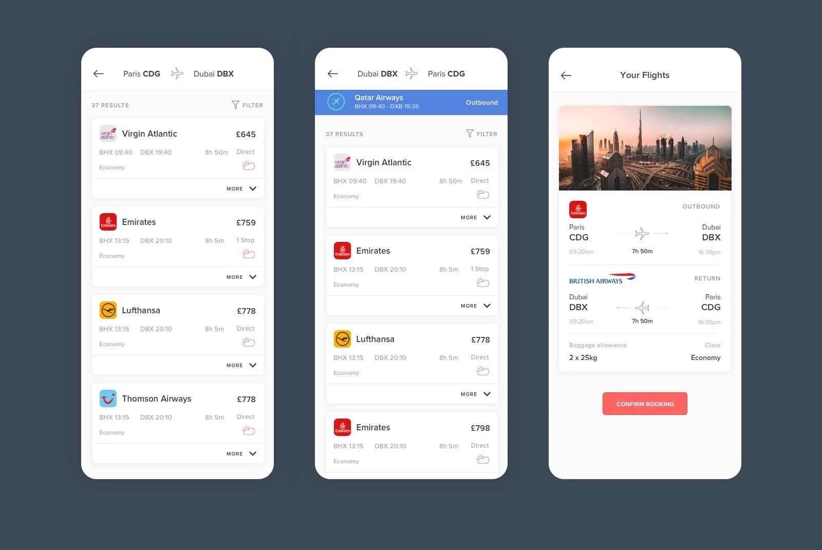
I took flight booking systems as my subject matter for this project and began looking at some of the patterns used by various travel companies in their web and mobile applications. Exploring the way a user could navigate between selecting there chosen destination, departure, return and their preferred seating for the flight.
Deciding on the flow
This series of user flows gave me something to design against. For the purpose of this piece I wanted more of a white label look and feel, opting for my own colour palette as opposed to using an existing brand.
I split the smaller interactions such as date selection, selecting the number of passengers and the cabin class into pop up overlays. The aim here was to give users a sense of context of where they are, where they are going in the process and how they can get back if needed.
Thought processes
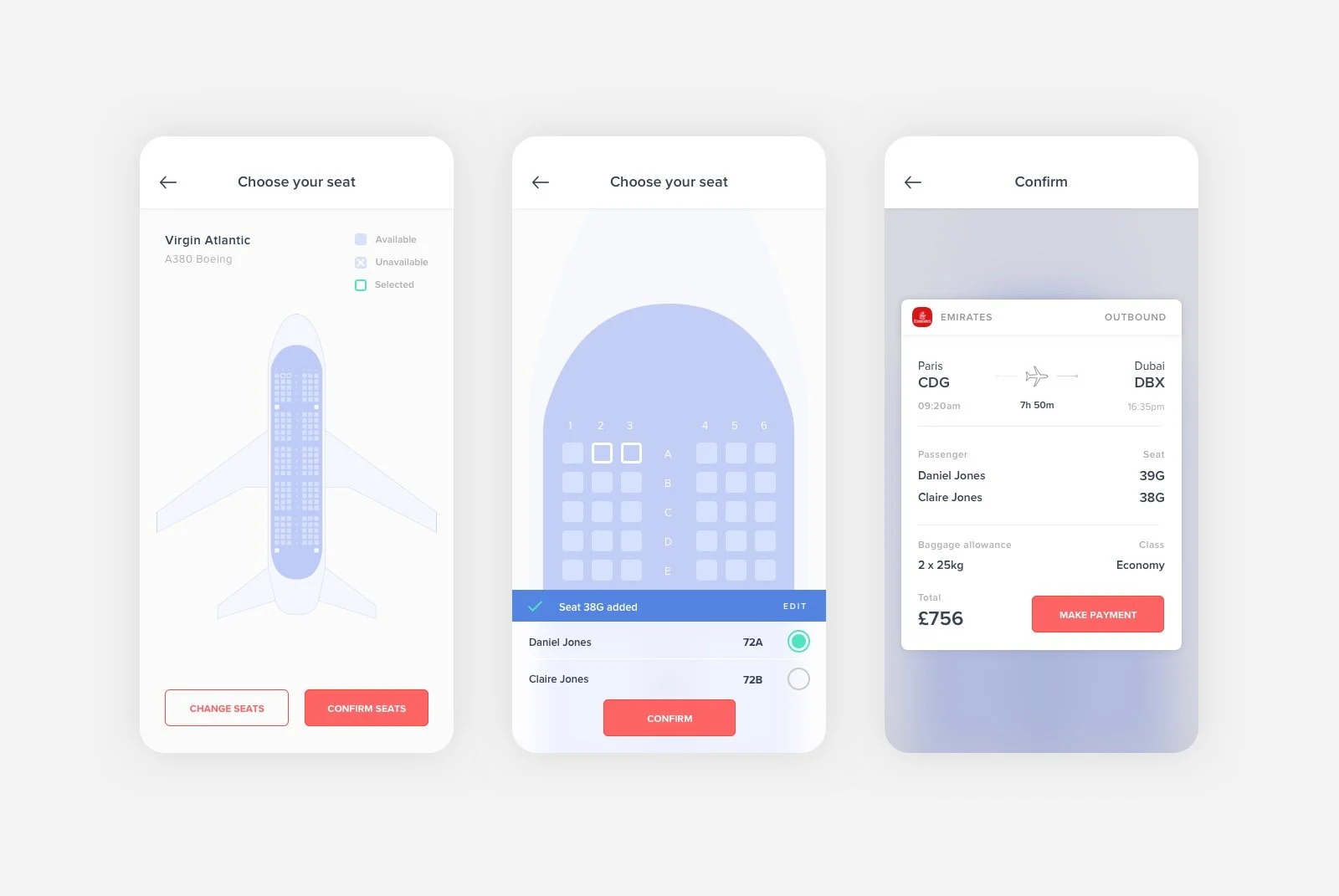
Larger processes logically were split out into their own pages. The most enjoyable and time consuming part of the process was the seat selection stage. I reworked this part a few times. One flow idea was to show options for in-flight meals but it started to bloat and convolute the task of selecting and confirming your seat.
So I opted to keep it confined to simply selecting your seat. making it easier to see how to view a selection or change it if required.
Bringing the designs to life
This short animation was created using Principle for Mac to keyframe the flow for the seat selection. The flow see’s the user select a seat for each passenger on a diagram of plane before confirming and the proceeding to the payment process. The designs were created using Sketch, the iconography was made using Adobe illustrator.


