Shell Energy Registration
Optimising and re-platforming the registration journey for Shell Energy to reduce system errors, improving the user interface and increase conversion.

Journey mapping group exercise.
Design Sprints & Ideation Sessions
Using research and analytics, we identified key issues in the registration journey. I led design sprints, including journey mapping and sketching sessions, to streamline the process and address customer pain points. From these sessions, I distilled the best ideas and developed low-fidelity prototypes for user testing.
Concept A
A low-fidelity mockup from the group explored a quick sign-up tool, enabling customers to save their quote for later. It also introduced new payment options—pre-pay and cheque alongside direct debit—expanding beyond the business's current offerings. Additionally, it incorporated cross-selling opportunities for services like broadband and boiler cover.

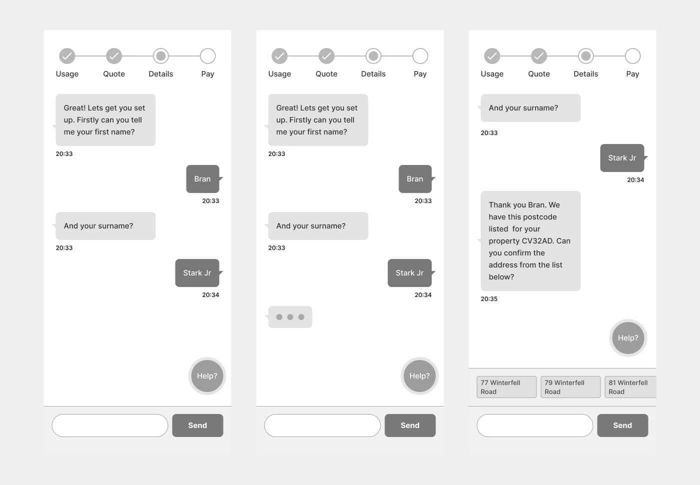
Concept B
The idea was to create a more conversational registration process, where users could enter their details and make selections naturally as prompted, leading to a personalised quote.
Final designs
Building on the best ideas from journey mapping and sketching sessions, I designed a new journey and layout, then conducted an A/B test against the old version.
Key takeaways:
Customers preferred bite-sized steps over the original long, single-page form.
Seeing their selections throughout the signup process improved clarity.
Explaining why personal data was needed reassured users.
Educating users about the energy switching process reduced payment-related inquiries.

Design layouts
-

Address details
As part of the sign up process there is a business requirement to confirm the address as well as 3 years of address history.
-

Address details continued
An area of improvement vs the old journey was providing an order summary. This was very popular during user testing.
-

Existing customer
The new process will detect existing customers to prevent costly duplicate registrations and manual processing.
-

Personal details
Reducing the the number of fields required help to make the sign up process less daunting for a customer.
-

Summary & Payment
Allowing the users review personal details before proceeding to make their payment provided a level of reassurance.
-

Confirmation
A confirmation page provides closure to the process as well as details of the next steps and what to expect.